
- Client
- Casa Capicola
- Industry
- Food and hospitality
- Scope
- Identity, packaging, signage, apparel, web
- Year
- 2026
- Location
- Saskatoon, SK
The problem
A name and an empty room. No logo, no menu, no walls yet.
What we built
The full identity in eight weeks: logos, patterns, illustration, menus, signage, window graphics, apparel. Then a website rebuilt in a week.
Result
The story
Casa Capicola isn't just a sandwich shop. It's a love letter to a dad's kitchen, opened in downtown Saskatoon.
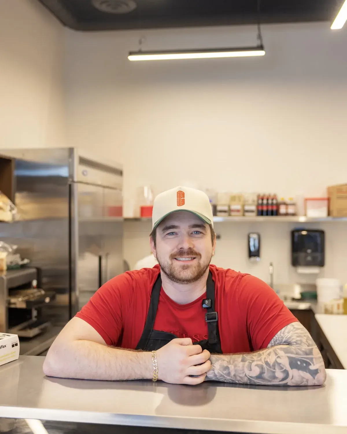
When Austin came to me, he had a name, an empty room and a one-line brief: "I like classic Italian. We sell Italy on a bun." The name was already perfect. Capicola is his favourite meat, and casa is Italian for home.
The challenge? Austin isn't Italian. He fell in love with Italian sandwiches the way most of us fall for food, at a kitchen table with his dad. So the brand had to feel authentic without pretending, and professional enough to win over a tough downtown crowd from day one.
Pitched before the walls went up
I like to show a brand where it's going to live. So I presented the identity in Austin's shop before it had walls. Electrical cables, bare concrete, and a printed booklet of the whole brand.
He walked the entire room with it. This goes here. That goes there. When the owner can already see it on the walls, you know the brand fits.
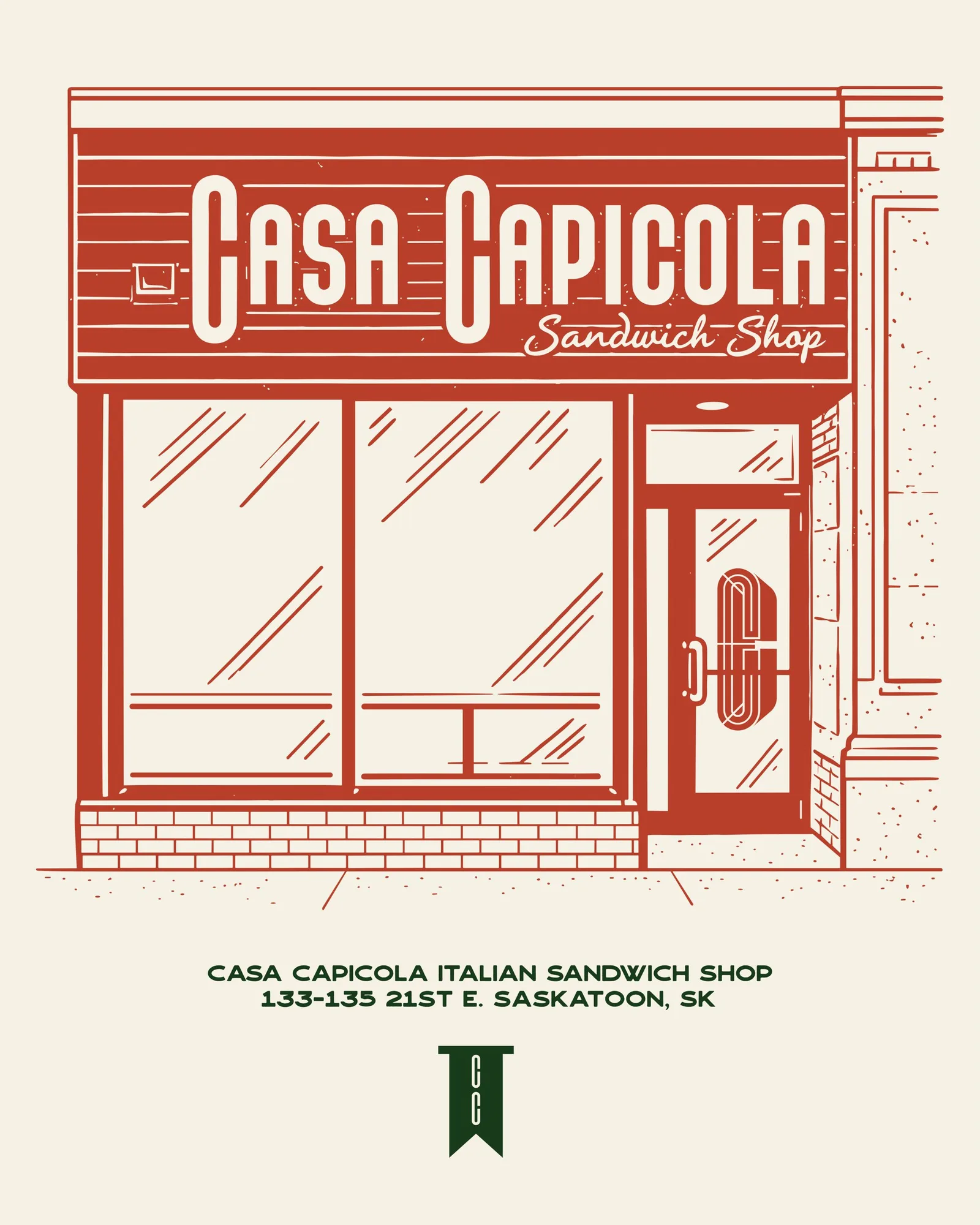
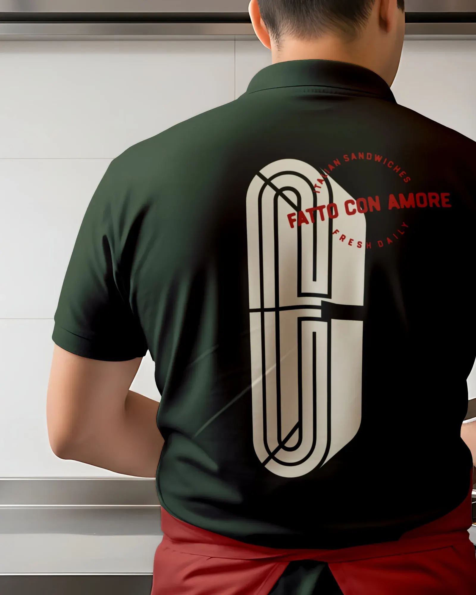
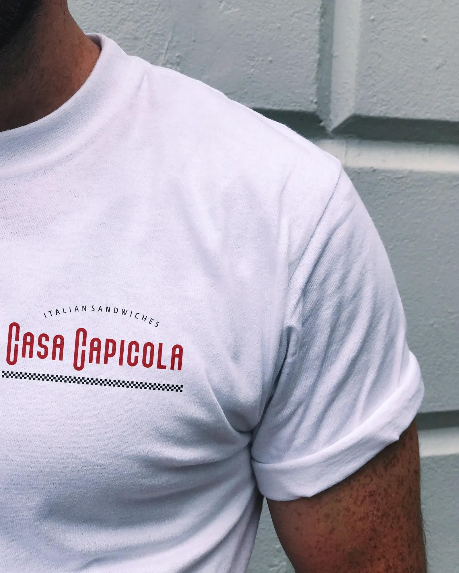
Once the shop was open, I drew the storefront as an illustration for apparel. The place people loved became something they could wear home.
Home, in a name
Austin has some swagger, but underneath he's a big teddy bear. I wanted the brand to feel exactly like that: confident from across the street, warm once you're inside.
The C icon started with a hunk of capicola, tied tight with twine. Look closely and you'll see the string wrapping through the letter. It holds up on its own on a hat, a door or the back of a polo.
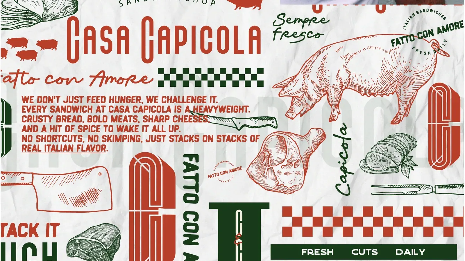
A classic Italian wordmark keeps it polished, and meaty, grungy type on the menu brings the hand-made feel. The palette came straight off the counter: Spicy Capicola, Basil Leaf, Deli Paper and Apron.
Fatto con amore
A great sandwich shop has a voice. You should be able to hear it before you take a bite.
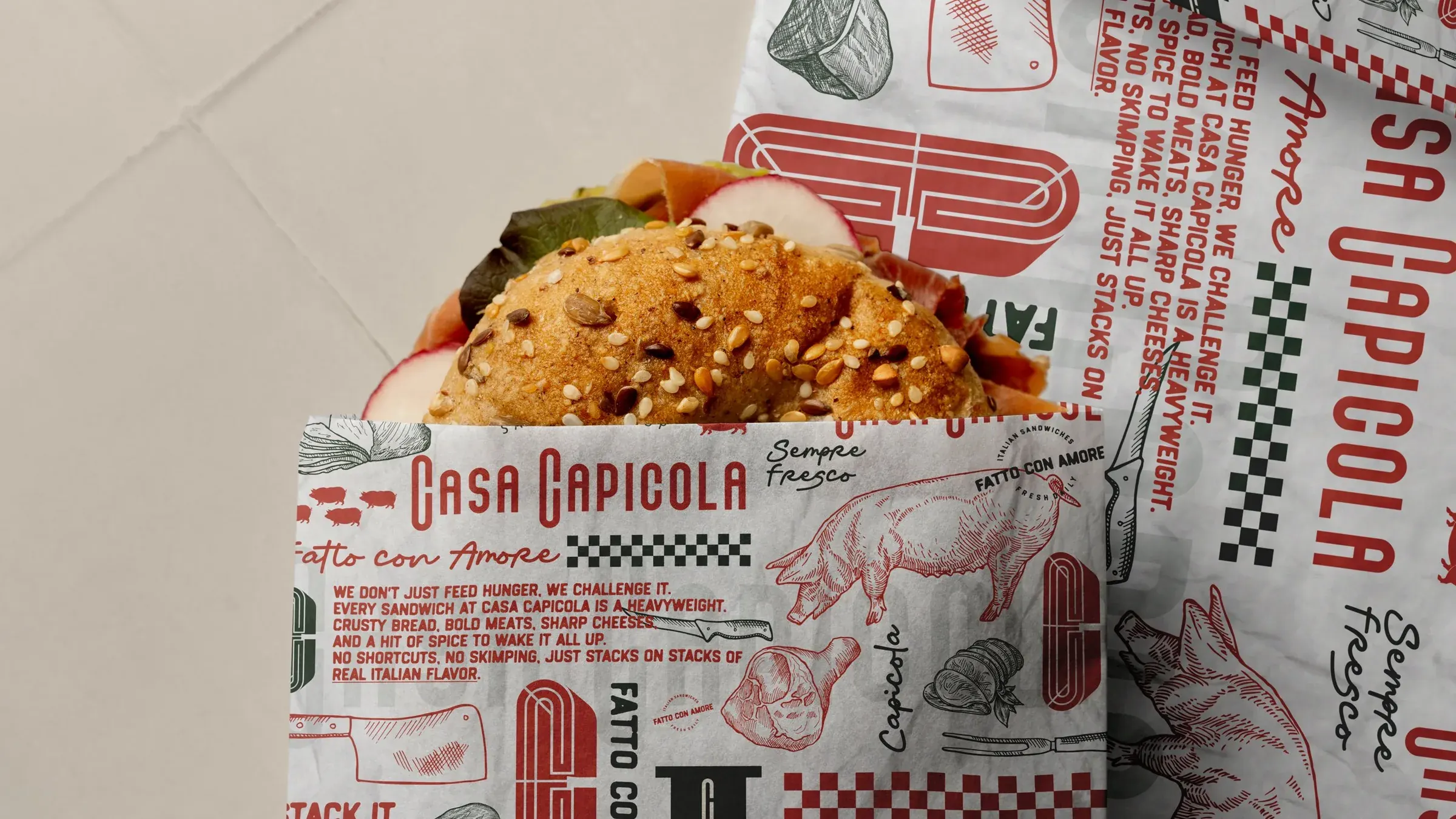
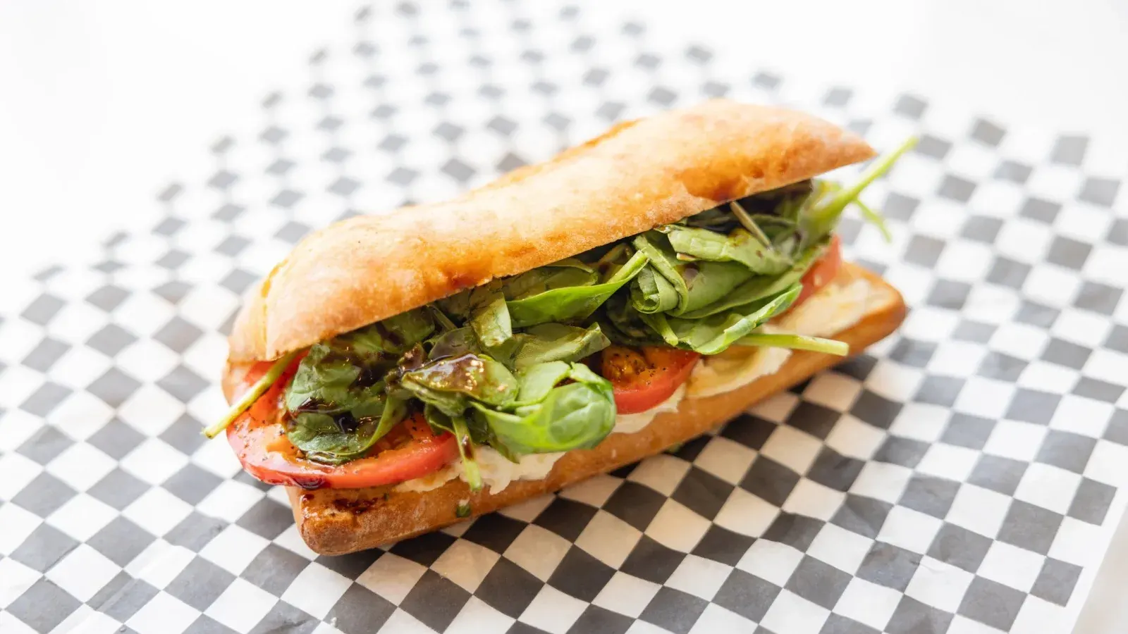
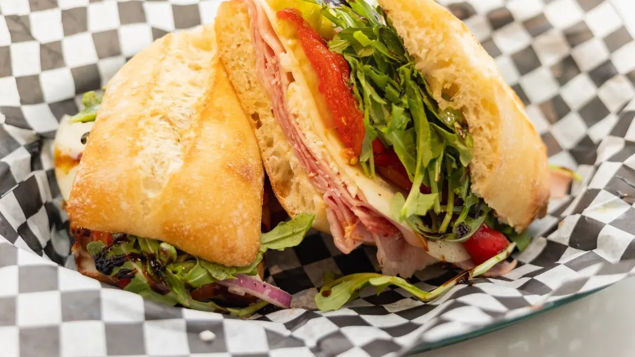
Fatto con amore, made with love, runs through everything: the pattern, the deli paper, the back of every polo and the menus. The pattern does the talking so the staff don't have to. Crusty bread, bold meats, sharp cheeses, no shortcuts.
A website that matched the shop
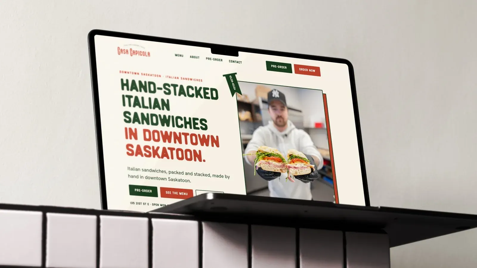
After launch, the website someone else built didn't look anything like the shop. For a new restaurant, that's a real problem. The website is often the first place someone meets you.
I was brought back to fix it. One week, start to finish. Same colours, same voice, same swagger, so the first impression online matches the one at the counter.
Built to be used
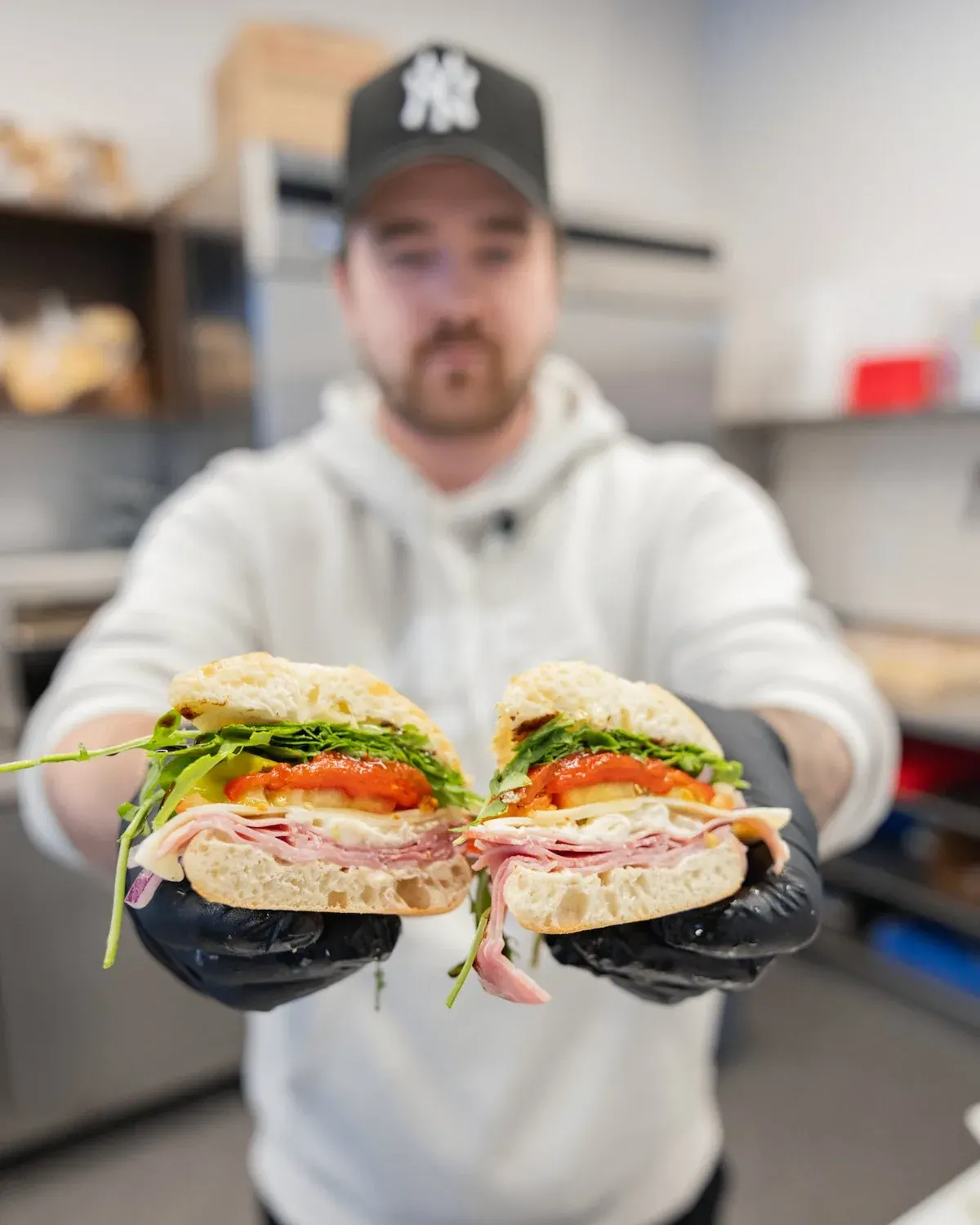
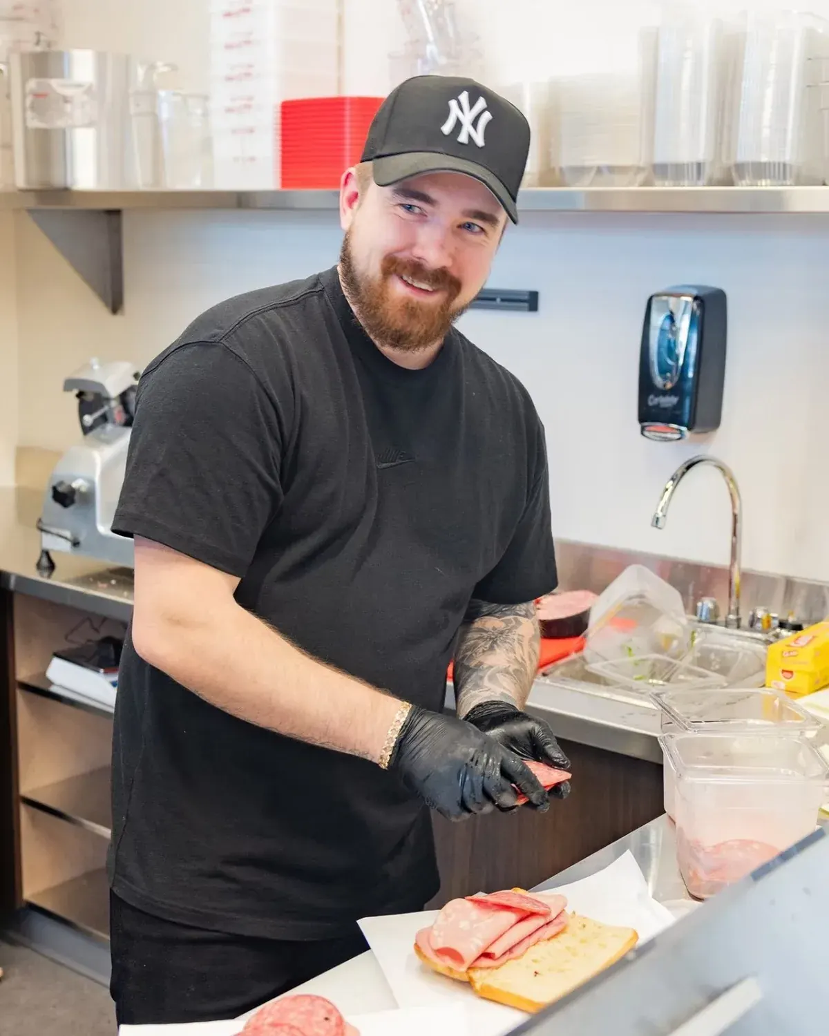
Downtown Saskatoon is a tough spot for a new restaurant. Casa Capicola is making it work, and it has partnered with local teams and businesses along the way.
That doesn't happen by accident. It's hard to build that kind of rapport when you don't look the part. Austin looked the part from day one, then took everything and ran with it.
"Absolutely nailed my vision on the first try. We have taken everything Jarrid has designed for Casa Capicola and ran with it. It's like he was a part of it right from the start."
Austin, owner